Color plays an essential role in art, design, and everyday life. It goes beyond red, blue, or green; artists and designers use, mix, and modify these colors to create appealing visuals. This guide explores one fundamental concept that helps achieve that effect: color tint.
If you’ve ever wondered what a color tint is and how it’s different from tones or the term shade, this article will give you a deep understanding in the simplest terms possible.
Introduction to Color

Color is all around us, and it’s a powerful tool in communication. From branding to interior design, color influences emotions and decisions. Artists and designers work with various aspects of color, including hue, tint, tone, and shade, to bring their ideas to life.
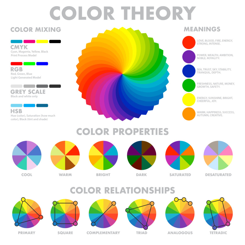
The color wheel helps us understand how different hues relate to each other. It shows all the colors created by mixing red, yellow, and blue. This wheel is the foundation of color theory, which explains how colors interact.
Further Reading: Color Trends and Strategies
What is Color Tint?
A color tint is a variation of a color that results from adding white to a pure hue, the unaltered version of a color on the color wheel. This addition, as white reduces the color’s intensity and increases its brightness, results in a lighter, softer version of the original color. For example, red becomes pink when mixed with white, and blue becomes light blue.
Tints maintain the base identity of the original hue while shifting its visual temperature and emotional tone. Artists, interior designers, fashion creators, and digital designers widely use these concepts alongside tint, tone, and shade to create soothing, elegant, or airy aesthetics.
Even a small amount of white can noticeably change how the color behaves in a composition when combined with neutral dark pigments. The more white added, the paler and more delicate the tint becomes. This makes tints ideal for backgrounds, subtle gradients, and gentle transitions.
How Tints Affect Mood
Tints create feelings of calmness, lightness, and innocence. Designers often associate them with pastel palettes that convey a peaceful and balanced atmosphere. For example, pink evokes softness and warmth, while light blue brings to mind clarity and tranquility. These qualities make tints particularly effective in wellness products, baby items, and minimalist design themes, where designers frequently incorporate shades as well.
Understanding Color Theory
Color theory studies how colors mix, interact, and influence each other, especially regarding how they represent pure color. It provides a foundation for creating visually appealing and emotionally resonant designs.
Understanding color theory allows creators to predict how different hues will work together. This helps them build balanced, harmonious color schemes that include tone for various applications, such as branding, interior design, and digital interfaces.
Colors, including gray, affect perception and mood, making their correct use critical in design. By applying color theory, artists and designers can evoke the right emotions and effectively guide user behavior.
The Color Wheel Explained
The color wheel is a circular chart that visually represents the complementary relationships between colors. It includes primary, secondary, and tertiary hues arranged logically.
- The building blocks are primary colors: Red, blue, and yellow. No one can create them by mixing other colors.
- Mixing two primary colors forms secondary colors. For example, red and yellow make orange, blue and yellow make green, and red and blue make purple.
- You create tertiary colors by mixing a primary color with a neighboring secondary color. Examples include red-orange, blue-green, and yellow-green.
The color wheel also helps identify color harmonies. These include complementary colors (opposites, like blue and orange) and analogous colors (side-by-side, like green, blue-green, and blue).
Designers use the color wheel to achieve balance, contrast, and visual interest. It is a practical guide for combining hues that enhance readability and impact.
Hue and Its Variations
Hue refers to the original color on the color wheel, such as red, blue, or yellow. The base form of any color exists before you mix in any other pigment.
While many use “color” to describe all variations, hue specifically means the unaltered version. It is what gives a color its identity and places it on the color wheel.
Changing a hue with white, black, or gray can make it lighter, darker, or softer.
- When white is added, it creates a tint, making the color brighter and more delicate.
- Black added to a hue results in a shade, which increases color intensity.
- Mixing in gray gives you a tone that offers a more muted and neutral appearance.
These changes allow artists and designers to create shades of emotion, depth, and contrast through mixing shades in any artwork or design. Mastering these basics helps you build better color combinations.
Tint, Tone, and Shade: Understanding the Differences
Knowing the key differences between a tint, tone, and shade can help you create more intentional and effective color palettes.
Tint
- Created by: Adding white to a pure hue.
- Effect: Makes the color lighter, softer, and less intense.
- Example: Blue + white = light blue.
Tone
- Created by: Gray added to the original hue.
- Effect: Mutes the color, making it more subtle.
- Example: Purple + gray = dusty violet.
Shade
- Created by: Adding black to a color.
- Effect: Makes the color darker and more dramatic.
- Example: Red + black = burgundy.
Quick Comparison Chart
| Variation | How It’s Made | Resulting Effect |
|---|---|---|
| Tint | White added | Lighter and less intense |
| Tone | Gray added | Muted and subtle |
| Shade | Black added | Darker and more intense |
Also Learn: How to Create an Aesthetic Muted Color Palette for Your Website
The Power of Color Tints in Design

Tints are everywhere in modern design. From websites and mobile apps to packaging and advertising, a tint can effectively communicate mood, enhance visual clarity, and guide user interaction.
A tint takes the intensity of a pure hue and softens it by adding white, creating a calmer, more approachable version of the original. This subtle shift is especially valuable in user-focused design, where emotion and accessibility play a significant role.
Why Use Tints?
- Create softness: Pastel tints bring a gentle, soothing touch ideal for wellness, lifestyle, and children’s brands. These lighter hues often feel more inviting and less overwhelming than saturated colors.
- Improve readability: Light tints used as backgrounds provide contrast without being harsh, making text and graphic elements more straightforward to see and reducing eye strain.
- Establish hierarchy: Designers often use lighter versions of a dominant color to highlight less critical elements while maintaining visual unity. This creates depth without distraction.
Common Uses
- Healthcare: Light blue and mint green colors convey cleanliness, calm, and care.
- Beauty: Tints like blush pinks and soft lavenders evoke femininity, luxury, and relaxation.
- Tech: Soft blues and neutral pastels contribute to sleek, modern interfaces that feel light, user-friendly, and professional.
Using tints strategically allows designers to maintain brand consistency while creating visual interest and emotional resonance.
Know More: Online Store Conversion & What Colors Make People Want to Buy
Exploring Shades and Their Effects
Adding black to a pure hue creates a shade and makes it darker. Shades add drama, depth, and formality.
How Shades Influence Design
- Create contrast: Use shades against lighter tints.
- Establish mood: Darker tones feel serious or elegant.
- Balance brightness: Offset vibrant colors with deep shades.
Real-Life Examples
- Burnt sienna: A rich shade of orange used in painting.
- Navy blue: Often used in corporate branding for authority.
Using Color in Design Effectively
Color is not just visual; it’s psychological. The basic principles of color use in design aim to evoke specific reactions and guide user behavior.
Warm vs. Cool Colors
- Warm colors like red, orange, and yellow are energetic and attention-grabbing: They create feelings of warmth, excitement, and urgency in design.
- Cool colors like blue, green, and violet are calming and peaceful: Designers often use them to build trust, create relaxation, or convey a clean and modern look.
Color Relationships
- Analogous colors sit next to each other on the color wheel: These include groups like blue, blue-green, and green, which feel harmonious and natural together.
- Complementary colors are opposite on the wheel, like orange and blue: They create a strong contrast and make each other stand out, perfect for call-to-actions or bold visual impact.
- When choosing colors, tints and tones help create visual balance and contrast: They make the design easier to read, more attractive, and emotionally engaging.
Further Reading: Guide to Visual Hierarchy in Website Design
Color Harmony and Contrast
Color harmony occurs when colors work well together visually. Designers achieve this through innovative combinations of tints, including color tint variations, tones, and shades.
Types of Harmony
- Monochromatic: One dominant color family with different variations (tints, tones, shades).
- Triadic: Three colors evenly spaced on the color wheel.
- Complementary: High contrast, energetic combinations.
Using Contrast
Contrast is essential for drawing attention. A bright color next to a neutral color or dark shade creates visual focus.
Common Color Mistakes to Avoid
Mistakes in color application can make even well-designed projects fail to communicate effectively. Color impacts user perception, mood, and navigation, so misuse can negatively affect aesthetics and functionality.
Top Mistakes
- Using too many colors leads to confusion and visual clutter, weakening the brand’s identity.
- Ignoring contrast: Hurts readability, especially for text and call-to-action elements.
- Overusing vibrant hues can overwhelm viewers and distract from meaningful content.
- Using similar tints or tones: Creates a flat design lacking depth and visual interest.
Tips for Better Color Use
- Limit your palette to 3–5 specific colors to maintain harmony and consistency.
- Use a dominant color and build around it with complementary tints, tones, and shades.
- Test your designs on different devices and lighting conditions to ensure accessibility and accurate color representation for all users.
The Future of Color Design
As technology evolves, so does the way we understand and use color. In modern design, the application of color, including color tint, is becoming increasingly data-driven and user-centric. AI and Machine Learning tools analyze user behavior and brand identity to recommend precise color schemes, including ideal tints, tones, and complementary hues. These tools help ensure color choices look aesthetically pleasing and align with brand values and audience expectations.
Emerging Trends
- AR/VR Integration: In augmented and virtual reality environments, there’s a growing demand for immersive, real-time color customization. Designers now explore how different hues shift with lighting, movement, and user interaction to create engaging and adaptive digital spaces.
- Sustainability in Color: Eco-conscious design is rising, leading to more frequent use of neutral dark pigments, earth tones, and colors derived from natural dyes. Brands now use subdued palettes to communicate environmental responsibility.
- Inclusive and Accessible Design: With heightened awareness around inclusivity, there’s increased focus on using color combinations that are legible to users with color vision deficiencies. This includes enhanced contrast, proper brightness, and clarity across all devices and interfaces.
Expect to continue shifting toward subtle tints, complex colors, and multi-dimensional palettes that respond dynamically to user needs across UI/UX, fashion, interior design, and branding.
Learn More: How to Become a UX Designer
Conclusion: Mastering the Use of Color Tint
Understanding what a color tint is and how to use it effectively gives you a strong foundation in color theory. Whether you are a beginner or a seasoned professional, using tints alongside tones and shades adds depth, emotion, and clarity to your designs.
You can craft vibrant and harmonious palettes by working with the same hue and modifying it through tints, tones, or shades. Remember, even the white added to a specific color can change the entire mood of your composition.
Refer to the color wheel and let it guide your choices when in doubt. With practice, your understanding of all the colors, including how to use color tint effectively, will deepen, and your design work will benefit immensely.
FAQs About Color Tint
What is a tint in color theory?
Adding white to a pure hue creates a tint, which results in a lighter, less intense version of the color.
What is the difference between a tint and a shade?
We create a tint by adding white and a shade by adding black. Tints are lighter; shades are darker.
Can all colors be tinted?
You can tint all the colors on the color wheel by mixing them with white.
How do designers use tints in digital design?
Designers use tints in backgrounds, hover effects, and to build visual hierarchy. Tints enhance readability and improve aesthetic appeal.
What’s an example of a tint in real life?
Designers create pink by adding white to red, a standard tint. Another typical example is that they form light blue by mixing blue with white.
