Color is more than just a design choice, it’s a silent storyteller that whispers directly to our emotions. Among all colors, red stands out as the boldest, the most commanding, and often . From stop signs to red logos like Netflix and YouTube, red grabs our attention and doesn’t let go. But why does red resonate so deeply with us?
Red is the color of life and energy, it’s the fire in our veins, the warmth of passion, and the urgency of action. It evokes feelings of excitement, power, and even hunger, making it a popular, itr choice for brands that aim to stand out in crowded markets.
This blog will explore how red logos and branding drive brand power and influence. From the psychological impact of red to its cultural significance and strategic use in design, we’ll uncover why this color is the ultimate weapon in a brand’s arsenal. So, let’s dive in!
The Psychology Behind Red: More Than Just a Bold Color Choice
Red is more than just a color, it’s an emotional powerhouse. It evokes passion, urgency, and energy, making it a dynamic force in branding to capture attention and connect deeply with audiences.

Emotional Connections: Red Speaks to Our Instincts
Red is the color of passion, energy, and urgency. It taps into our most primal instincts, sparking emotions ranging from love and excitement to caution and boldness.
For instance, red is commonly associated with passion and romance but can also symbolize strength and determination, making it an incredibly versatile choice in branding.
Physiological Impact: Red Drives Action
Did you know that simply seeing red can physically impact us? Studies in color psychology reveal that red can increase heart rates, stimulate appetite, and even create a sense of urgency.
This is why brands often use red for call-to-action buttons, sales promotions, and fast-food advertising. It triggers quick decision-making, encouraging consumers to act swiftly, a powerful tool for brands aiming to drive conversions and engagement.
Cultural Significance: Red’s Meaning Around the World
The color red carries different meanings across cultures, adding layers of complexity to its use in branding. In China, red represents luck, prosperity, and joy, often associated with celebrations and success.
In Western cultures, red can symbolize danger, warning, or urgency but also passion and love. These cultural nuances make red a bold yet thoughtful choice for global brands seeking to resonate across diverse audiences.
Explore: A Guide to Logo Design: Key Rules to Follow
Make Your Brand Unforgettable with a Bold & Powerful Red Logo
Red grabs attention and evokes powerful emotions. Let Seahawk create a bold and dynamic logo that turns heads and builds a powerful influence for your brand.
Why Red Logos Work for Brands: Attention-Grabbing and Memorable
Red logos have an unparalleled ability to grab attention and remain etched in the memory. Their boldness and emotional resonance make brands instantly recognizable and impactful.
Visibility and Impact: Standing Out in a Sea of Colors
Red demands attention like no other color. Whether it’s on a billboard, a storefront, or a digital platform, red logos are impossible to ignore. Its high visibility and bold nature make it a favorite among brands that want to capture instant recognition and stay top-of-mind.
Check: Top Picks for Best Inexpensive Logo Design Services
Symbolism in Branding: Powerful Messages Conveyed by Red Logos
The messages behind red logos are powerful and varied. Coca-Cola’s red symbolizes excitement and refreshment, while Netflix uses it to represent bold, modern entertainment. Red becomes more than just a color; it’s a signal of the brand’s personality and promise.
Cultural Context: The Global Language of Red
As with its psychological impact, the cultural context of red plays a crucial role in logo design. For some brands, red symbolizes luxury and prosperity (as in Chinese culture), while others use it to evoke urgency or excitement.
Further Reading: How to Create Your Logo for Website
Iconic Success Stories of Red Branding

Red has played a pivotal role in some of the most successful branding stories worldwide. Its ability to evoke excitement, energy, and urgency has made it a cornerstone of memorable and impactful brand identities.
Coca-Cola: A Global Symbol of Refreshment
Coca-Cola’s use of red is legendary. The bright red logo is instantly recognizable, evoking joy, energy, and fun. Over the decades, Coca-Cola has leveraged the emotional power of red to position itself as a drink synonymous with happiness and good times.
Netflix: Modern, Bold, and Unforgettable
Netflix’s red logo reflects its dynamic identity in the entertainment industry. The bold shade of red represents excitement, modernity, and the thrill of endless content, making it a perfect fit for a brand that thrives on global engagement.
The (RED) Initiative: Branding for a Cause
The (RED) initiative, co-founded by Bono, is a prime example of red’s power for social impact. By associating red with urgency and action, the initiative has successfully partnered with brands to raise awareness and funds to combat AIDS globally.
Other Examples: McDonald’s, Virgin, and Nintendo
- McDonald’s: Red stimulates appetite and creates a sense of comfort and familiarity, making it a staple in the fast-food industry.
- Virgin: The brand uses red to project boldness, energy, and a rebellious spirit.
- Nintendo: Bright red evokes fun, excitement, and nostalgia, aligning perfectly with its brand identity.
These examples highlight how red branding resonates across industries, proving its versatility and enduring impact.
Find: Best Branding Ideas for Your Business
Challenges of Using Red in Branding
Red is a powerful color, but its intensity can sometimes work against a brand. Overusing red or misapplying it can lead to a disjointed and negative brand experience. Knowing how to balance its use is critical to harness its true potential.
Overuse Pitfalls
While red captures attention, too much of it can be overwhelming. Excessive red in branding may evoke feelings of aggression, discomfort, or even confusion among consumers.
Brands must use red sparingly to maintain its positive impact and avoid diluting its emotional connection with the audience.
Balancing Act
Red shines the brightest when paired with complementary colors. Combining red with neutral tones like white, black, or soft pastels can create a more visually appealing and harmonious palette.
This balance helps soften the red’s intensity while maintaining its boldness and impact.
Context Matters
Not every brand’s identity aligns with red’s dynamic and attention-grabbing nature. For instance, brands focusing on tranquility, luxury, or a conservative image may find red too overpowering.
Understanding the context and brand message is essential to determining if red is the right choice.
Read More: How to Rebrand Your WordPress Website
Practical Tips for Incorporating Red in Branding

Using red effectively requires a strategic approach. From selecting the right shade to ensuring consistent application, thoughtful execution can elevate your brand’s appeal.
Choosing the Right Shade
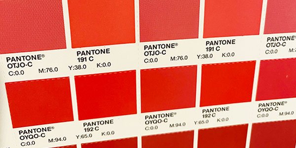
Different shades of red convey different emotions. Bright reds like scarlet are associated with energy and excitement, making them ideal for youthful or action-oriented brands.
Deep reds like burgundy evoke luxury and sophistication, aligning with premium or formal brands. Tailoring the shade to your brand’s tone ensures the message resonates with your audience.
Strategic Use
Red doesn’t need to dominate your design to make an impact. Use it sparingly in typography, call-to-action buttons, or key design elements to draw attention without overwhelming the overall aesthetic.
Red can also highlight areas of importance, creating visual hierarchy in branding materials.
Adjusting for Platforms
Red behaves differently across mediums. On digital platforms, it can be vibrant and eye-catching, but in print, it might appear muted or oversaturated.
Brands should test red across different platforms to ensure consistency in their visual identity, making adjustments for lighting, contrast, and textures.
Further Read: Basic Principles of Website Design That Drives Sales
Is Red Right for Your Brand?
Choosing the right brand color goes beyond aesthetics—it’s about aligning with your values, message, and target audience. While red can be a game-changer, it’s not a universal fit for all brands.
Key Questions to Ask
Ask yourself: Does your brand aim to evoke excitement, urgency, or passion? If your goals include boldness, energy, or standing out in competitive markets, red could be a great fit. However, for brands seeking to convey calmness or trust, red may not be the ideal choice.
Matching Brand Identity
Red works best for brands that thrive on high-energy interactions, like food, entertainment, or retail. If red aligns with your brand’s personality and values, ensure its usage enhances your overall identity and messaging, creating a seamless visual experience for your audience.
Alternatives
When red isn’t the right fit, other colors can take center stage. Blue conveys trust and calmness, green represents growth and sustainability, and yellow symbolizes optimism and creativity. Consider your brand’s emotional goals when exploring alternatives to red.
Read: The Apple Logo: History, Evolution, and Design Impact
Conclusion: Red’s Role in Driving Brand Power and Influence
Red is more than just a color; it’s a force that can shape perceptions, evoke emotions, and drive consumer behavior. From its ability to command attention to its versatility in conveying energy, passion, and urgency, red is a bold and impactful choice for brands looking to stand out.
However, harnessing the power of red requires strategy and balance. Overuse can overwhelm, while the wrong shade or context can miscommunicate your brand’s message. When used thoughtfully, red can create an emotional connection, establish brand recognition, and drive influence across global markets.
Ultimately, red is a powerful tool in the branding palette, but it’s not one-size-fits-all. For brands that want to be bold, memorable, and emotionally resonant, red can be a game-changer when applied with intention and precision.
Some FAQs on Red Logos
What company has a red logo?
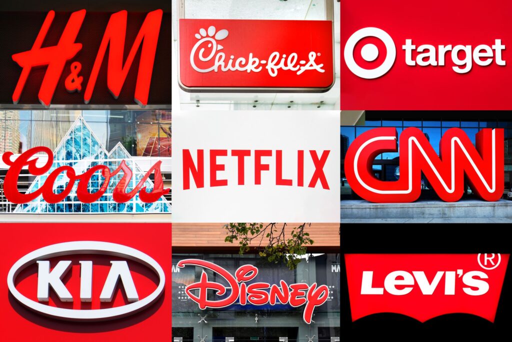
Several famous brands have embraced the colour red in their logos to make a bold statement. For instance, the CNN logo is globally recognized and symbolizes timely and impactful news. Other examples include Coca-Cola, YouTube, and Target.
What brand is associated with red?
Coca-Cola is one of the most iconic top brands associated with the red color. Red is often chosen by brands that want to appear energetic, exciting, and bold. News networks like CNN and brands in the cybersecurity company sector also use red to represent urgency, power, and the network’s commitment to delivering timely and relevant updates.
What does the color red mean in a logo?
In color psychology, red symbolizes passion and energy, urgency, and excitement. It can also trigger strong emotions and attract attention, which is why it’s commonly used in the logos of famous brands.
Is red a good color for a logo?
Yes, red is a powerful choice for logos. It helps a brand enhance recognition, stand out from competitors, and evoke strong emotions. Whether it’s red lipstick for bold beauty branding or red wine tones for elegance, a custom red logo can support your branding efforts and communicate your key messages clearly.
What does red mean in branding?
In branding, red means power, urgency, and emotional intensity. It’s often used to create a connection with the audience by generating an emotional response.
What is the color rule for branding?
A basic rule in branding is to use complementary colors from the color wheel. Combining cool reds with neutral tones or pairing dark red with accents like orange or purple creates visual harmony. These color combinations help balance emotion with clarity while staying true to your brand’s essence.
What is the red color theory?
The red color theory suggests that red activates physical responses, it can raise heart rate and attract immediate attention. In branding, it reflects strong emotions, urgency, and desire.
What is pink branding?
Pink branding is softer and often used to express friendliness, fun, and care. Unlike the intensity of red, pink brings warmer feelings and tends to be associated with playfulness, nurturing, or creativity.


