When it comes to UI/UX design, every little detail matters, and that includes the background or page color. It’s not just about making your design look “pretty.” The color you choose for your design canvas can influence mood, guide user focus, and even impact how people perceive your brand.
The great thing is, Figma gives you total flexibility when it comes to customizing your canvas. Whether you want a soft neutral tone for minimalism, a dark background for contrast, or something vibrant to match your brand’s energy, Figma makes it easy to experiment until you find the perfect fit.
In this blog, we’ll explore:
- The psychology behind page colors and how they influence user emotions.
- Real-world use cases for different background colors in digital design.
- Best practices for choosing a page color in Figma that enhances your project’s visual impact.
By the end, you’ll have the knowledge (and inspiration) to choose the perfect page color for your next design project, and make it stand out for all the right reasons.
Why Page Color Matters in UI/UX Design?
Choosing the right page color is more than just a visual preference, it’s a critical part of effective UI/UX design.

Impacts Mood, Readability, and Design Accuracy
Colors have a powerful effect on emotions. A bright white background can feel clean and modern, while a soft beige might create warmth and friendliness.
Beyond mood, the background color affects text readability and color accuracy. If your design is meant for a dark mode interface, working on a pure white canvas may give you a misleading sense of how it will look in real life.
Helps Set the Tone for the Product or Brand
The background is like the stage for your design, it sets the overall tone before a user interacts with any content. For example, a luxury brand might benefit from a muted, darker page tone to suggest elegance, while a children’s app could use brighter, more playful colors for energy and fun.
Influences How Design Elements Are Perceived
The same button, icon, or image can look completely different depending on the background. Certain colors pop against dark tones but blend into light ones, and vice versa.
Choosing a background that matches your intended end-use environment ensures your design translates well to the final product.
Discover: Understand Design Psychology for Better UX
Default Page Color in Figma: Pros and Cons
When you open a new file in Figma, you’re greeted by its default pure white background. While simple, it’s a deliberate choice that works for most projects.
Pros: Why it Works for Most Use Cases
- Neutral Starting Point: White doesn’t clash with any color scheme, making it ideal for brainstorming and experimenting.
- Clean and Familiar: Many designers are accustomed to starting with white because it mimics paper or standard design tools.
- Good for Light UI Projects: If your final design will be displayed on a white or light interface, the default background gives an accurate preview.
Cons: When You Might Want to Change it
- Not Ideal for Dark Mode Designs: A bright white background can distort how colors will appear in dark-themed UIs.
- Can Cause Eye Strain: Long hours of working on pure white can be tiring for the eyes.
- Doesn’t Reflect All Real-World Contexts: If your product will live on a colored or textured background, white won’t give you a realistic sense of the final look.
Changing the page color in Figma is quick and simple, and can dramatically improve the accuracy and comfort of your design workflow.
Ready to Elevate Your Designs?
Start experimenting with page colors in Figma today and create stunning, user-friendly interfaces!
Best Page Colors for Different Design Scenarios
The “best” page color in Figma depends on what you’re designing, who it’s for, and where it will be used. Different backgrounds influence perception, contrast, and even your comfort while working. Here’s a breakdown of the most effective options and when to use them.
White or Light Gray

Best for: Clean, minimal UIs and accessibility checks.
A white or light gray background is the go-to for most designers because it’s neutral and distraction-free. It works perfectly when creating sleek, modern user interfaces where content needs to shine without visual interference. Light gray, in particular, can soften the brightness of pure white while still providing clarity.
Why it works:
- Makes text and UI elements appear crisp.
- Provides a realistic view for websites or apps with light-mode layouts.
- Helps during accessibility checks, especially for ensuring adequate color contrast.
Common uses: App dashboards, SaaS product UIs, minimal web designs.
Dark Gray or Black
Best for: Dark-mode interfaces and high-contrast designs.
If your end product will have a dark mode, starting your design with a dark gray or black background ensures your color palette works in that environment from the start. Dark backgrounds also make bright colors pop, which is useful for testing buttons, icons, and accent elements.
Why it works:
- Helps evaluate contrast and visual hierarchy in dark-themed products.
- Reduces glare when designing in low-light environments.
- Gives an immediate sense of how light typography and vibrant elements will appear.
Common uses: Mobile apps with dark themes, gaming UIs, streaming platforms.
Neutral Tones (Beige, Off-White, Soft Gray)
Best for: Long design sessions, branding projects, and print previews.
Neutral tones like beige or soft gray can reduce eye strain, a lifesaver for designers spending hours on Figma. These shades also work well when previewing designs that will be used in print or brand materials, as they can mimic the warmth of paper or natural surfaces.
Why it works:
- Comfortable for extended design sessions.
- Creates a subtle, elegant backdrop for branding mockups.
- Mimics real-world textures, making designs look more natural.
Common uses: Brand identity projects, packaging design, marketing materials.
Brand-Driven Backgrounds

Best for: Ensuring accurate brand alignment and tone testing.
Sometimes, your design needs to live inside a brand’s visual identity from day one. Using a brand’s primary or secondary color as the page background in Figma can help test how the full design system behaves in context.
Why it works:
- Ensures every element works harmoniously with brand colors.
- Helps simulate real product environments (e.g., branded landing pages, event signage).
- Useful for tone and mood testing in marketing campaigns.
Common uses: Corporate websites, event designs, promotional assets, branded apps.
How to Change Page Color in Figma?
Changing the page (canvas) color in Figma is quick and can make a huge difference in how your design feels while you’re working on it. Here’s a simple step-by-step guide to help you customize it for your project’s needs. Here’s a step-by-step guide:
Select the Canvas
Here’s how to do it:
- Open your Figma file and make sure no objects or frames are selected.
- Click on an empty space outside your artboards, you’ll see the Background option appear in the right-hand panel.
Navigate to Background Settings
Read to learn more:
- On the right panel, locate the Background section under the Design tab.
- This is where you can set your canvas color.
Use HEX/RGB Color Pickers
Read here:
- Click on the color box to open Figma’s color picker.
- Enter a HEX code (e.g., #F5F5F5 for light gray) or RGB values to get an exact match.
- You can also adjust transparency if you want a softer effect.
Tips for Switching Between Light and Dark Testing Modes
Find out more:
- If you’re designing for both light and dark modes, duplicate your frame and test each version with its respective background color.
- Use a shortcut approach: Quickly switch between dark gray and white backgrounds to check contrast and accessibility.
- Save your frequently used colors in the Document Colors panel so you can switch instantly without re-entering codes.
Changing the page color is not just a cosmetic tweak, it’s an important part of design accuracy, accessibility testing, and creative comfort. The right background will help you see your project in its real-world context before you hand it off to clients or developers.
Accessibility Considerations When Choosing Page Colors
When selecting a page or background color in Figma, accessibility should always be part of your design checklist. A color that looks beautiful to you might be difficult for some users to read or interact with. Here’s how to keep your designs inclusive and compliant.
Ensure Enough Contrast with Foreground Elements
- High contrast between text/UI elements and the background ensures readability for users with visual impairments or color blindness.
- Avoid pairing light text with light backgrounds or dark text with dark backgrounds, even subtle shades can reduce clarity.
Use Accessibility Plugins in Figma
- Able and Contrast are popular Figma plugins that automatically check your design for color contrast compliance.
- These tools highlight potential issues and offer suggestions for adjustments without guesswork.
Follow WCAG Guidelines
- The Web Content Accessibility Guidelines (WCAG) recommend a contrast ratio of at least 4.5:1 for normal text, and a ratio of 3:1 for large text (18pt and above).
- Test both your light-mode and dark-mode versions to make sure they meet these standards.
Accessibility isn’t just about compliance, it’s about ensuring your designs are usable by everyone, which builds trust and improves the overall user experience.
Color Psychology in Page Design
Page colors don’t just affect readability, they also shape the way users feel and behave when interacting with your design. Choosing the right tone can subtly influence emotions, decision-making, and brand perception.

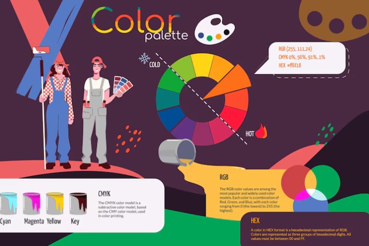
Warm vs Cool Tones
- Warm tones (reds, oranges, yellows) tend to feel energetic, passionate, and attention-grabbing.
- Cool tones (blues, greens, purples) often evoke calmness, trust, and stability.
Emotional Influence on UX
- The background color can set the overall mood of your interface, even before the user interacts with it.
- A soothing blue can make a finance app feel trustworthy, while a vibrant yellow can make a food delivery service feel fun and fast.
Practical Examples
- Calm Blues: Great for health apps, meditation tools, or banking services. They inspire trust and peace of mind.
- Energizing Yellows: Perfect for calls-to-action, e-commerce banners, or creative platforms where excitement is key.
- Professional Grays: Ideal for corporate websites, SaaS dashboards, and B2B products where a neutral, modern feel is important.
By understanding color psychology, you can align your page background with the desired emotional response of your target audience, making your design not just visually appealing, but strategically effective.
Expert Tips for Choosing the Best Page Color in Figma
Choosing a page color isn’t just about what looks nice, it’s about creating the right environment for your design to shine. Here are some professional, battle-tested tips used by experienced Figma designers.
Stick to Neutral Tones Unless Testing Brand-Specific Designs
Light gray, off-white, or soft beige make great default choices because they don’t distract from the actual interface elements. Reserve brand colors for when you’re testing how your product will appear in a real-world, branded environment. This keeps your design review process clean and unbiased.
Always Preview Designs on Both Light and Dark Backgrounds
Many users now expect both light mode and dark mode options. Previewing on both backgrounds ensures your typography, icons, and UI components work in all settings. This also helps identify contrast issues early in the design process.
Create Multiple Pages for A/B Testing Different Backgrounds
Instead of constantly switching your canvas color, duplicate your design into multiple pages or frames.Test variations side by side to see which background makes your design more readable, engaging, or brand-aligned.
Final Thoughts
When it comes to choosing the best page color in Figma, there’s truly no one-size-fits-all answer. The “right” background depends entirely on your design goals, your brand’s personality, and the experience you want to deliver.
A neutral gray might work perfectly for clean UI mockups, while a bold brand-specific color could be essential for marketing visuals or pitch decks.
The key is to experiment and test. Don’t hesitate to create multiple variations and see how your designs perform on different backgrounds.
Sometimes, simply switching from a stark white to a soft beige can completely change the feel of a layout, and make it easier to spot alignment, spacing, and contrast issues.
If you want to speed up your workflow, explore Figma’s built-in presets or try dedicated plugins that help you adjust and preview backgrounds instantly. Small tweaks to your page color can make a big difference in design clarity, mood, and accessibility.
At the end of the day, page color is more than just “decoration”, it’s a powerful design tool. Use it strategically, and your work will not only look better but also connect more effectively with your audience.


