You pull out your phone to search for something and open a website. As it loads, you notice one of two things: the site fits your screen perfectly, or you find yourself pinching and zooming just to read the content. This simple interaction highlights a critical choice for any business: the difference between a mobile site and responsive site. This isn’t just a technical detail. It’s a fundamental decision that impacts how your users experience your brand. It also determines your website’s visibility on Google.
A mobile site is a separate, dedicated website. It’s built from the ground up for mobile phones. It typically lives on a unique URL, like m.yoursite.com. A responsive site, on the other hand, is a single website. It uses the same URL for everyone. It adapts its layout to fit any screen size, from a large monitor to a small smartphone. The choice you make here dictates your future in web design. It affects everything from user experience to search engine rankings.
Google’s mobile-first indexing has shifted the ground rules. Google now judges your site based on its mobile version, making having a mobile-friendly site non-negotiable. The right approach can boost your rankings and delight your users, while the wrong one can frustrate them. Let’s explore these two strategies to help you make the best choice.
What is a Mobile Site (Mobile-Dedicated Website)?
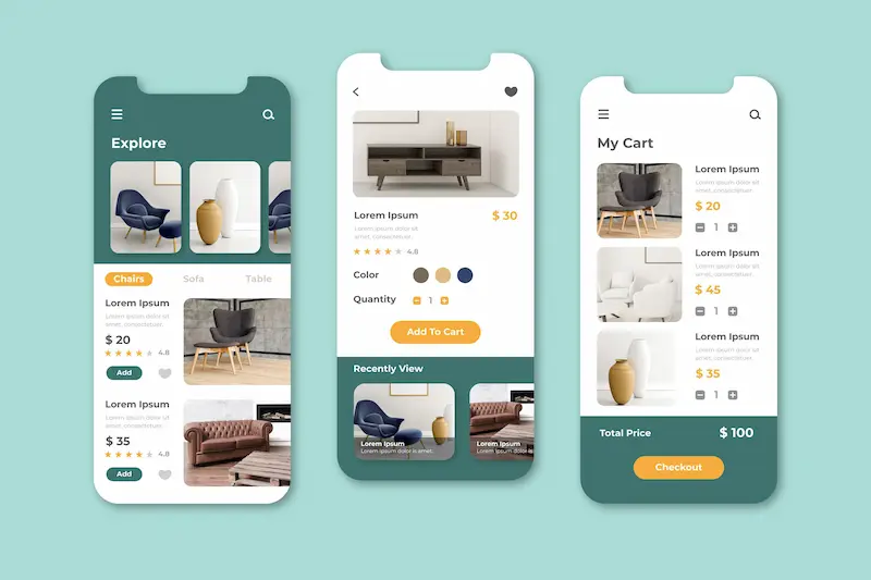
A mobile site is a separate and distinct website. It is designed and built to serve users on a mobile device. This approach was more common in the early days of the mobile internet. It created a simpler, faster experience for mobile users.
Definition and Technical Structure
A mobile-dedicated site is a standalone version of your main website. It resides on a different domain or subdomain.
A typical example is m.example.com. The server detects the user’s device type. If a mobile device is detected, the server redirects the user to the m. URL. The design is entirely separate from the desktop website. This means you are essentially managing two different websites.
Typical Content and Features
Mobile-dedicated sites often have streamlined content and features. The navigation is simplified, and the content is usually trimmed to the essentials. This approach aims to reduce page load times on slower mobile networks.
Some core content from the desktop version might be omitted. The focus is on providing a quick, easy user experience for tasks like finding a phone number or making a quick purchase.
Pros and Cons of Mobile Sites
A mobile-dedicated site offers a custom user experience. You can tailor the design and functionality specifically for mobile users. This allows for a highly optimized mobile design. However, this approach has significant drawbacks.
You must manage two separate sites, which doubles your maintenance overhead. Content duplication is a significant SEO pitfall. Having duplicate content on two different URLs can confuse search engines and dilute your ranking signals.
Ready to Build a Mobile-Optimized, Responsive WordPress Site?
Deliver a seamless user experience and boost your SEO with a custom-built WordPress site designed by experts.
What is a Responsive Site (Responsive Web Design)?
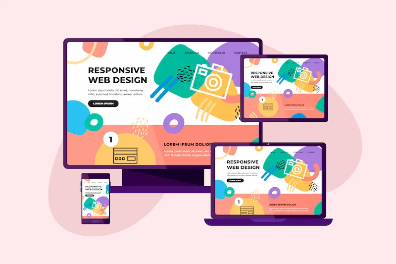
Responsive web design is the modern standard for creating mobile-friendly websites. It is a single website that adapts to the user’s screen size. It provides a consistent experience across all devices.
Definition and Underlying Technologies
A responsive website uses a single codebase. It employs fluid grids, flexible images, and CSS3 media queries, which allow the website layout to adjust automatically. The design “responds” to the user’s screen size.
The duplicate HTML content is served to all users. Only the presentation layer changes based on the device. This is a far more efficient approach to web design.
Content and Feature Parity Across Devices
A responsive website’s content remains the same regardless of the device. Users on mobile phones, tablets, or desktops see the same core information. The layout simply reorganizes itself to fit the available space.
For instance, a three-column layout on a desktop might become a single-column layout on a smaller screen. This ensures all users have access to the duplicate content.
SEO, Maintenance, and User Experience Benefits
Google recommends responsive design. A single URL for all devices avoids duplicate content issues. It also consolidates all your SEO ranking signals into one URL, which is crucial for mobile-first indexing.
A responsive site is easier to maintain. You only need to update one set of files. The user experience is consistent and seamless. A user can switch between a desktop user and a mobile user without losing context. This leads to lower bounce rates and higher engagement.
Explore Further: Responsive WordPress Web Design: The Key to Converting Mobile Visitors
Adaptive and Progressive Enhancement Approaches for Mobile and Responsive Sites
While responsive design is the most popular strategy, other methods exist for creating a mobile-friendly web experience. Adaptive design is a related but different concept. Progressive enhancement is a design philosophy that complements both.
Adaptive Design Overview
Adaptive web design serves multiple fixed layouts. It detects the user’s device and serves the most appropriate pre-designed layout. The website doesn’t fluidly resize. Instead, it “snaps” to a different layout at specific screen sizes.
This differs from a responsive site with a single fluid layout. It gives designers more control over the appearance on particular devices.
Progressive Enhancement Principle
Progressive enhancement is a strategy for building websites. The core idea is to deliver the most basic, functional content first, which is accessible on all devices and browsers. Then, you progressively add more complex features and design elements.
These enhancements are only visible to users with modern browsers and capable devices, ensuring a baseline experience for everyone.
When Adaptive or Combined Responsive-Adaptive is Used
Sometimes, a hybrid approach is best. A business might start with a responsive design for most of its site and then use an adaptive layout for a specific, highly customized page. This could be a complex product configurator or a particular mobile design.
This offers the flexibility of adaptive design with responsive efficiency. It’s a trade-off between control, performance, and complexity.
Also Learn: How to Easily Fix Responsive Menu Issues in WordPress
Mobile-First Strategy vs Reactive Responsive Design
The terms responsive design and mobile-first are often used interchangeably. However, they describe different approaches to the design process. Mobile-first is a design philosophy, while responsive design is the underlying technology.
What is Mobile-First Design?
Mobile-first design is a strategic approach that involves designing for small screens first. The team creates the mobile version of the site before the desktop version, forcing a focus on essential content and functionality.
You start with the most constrained layout. Then you scale up for tablets and desktops. This is known as progressive enhancement. It ensures the mobile user experience is never an afterthought.
Key Differences Between Mobile-First and General Responsive Design
A reactive responsive design might start with a desktop website layout. Then, it uses CSS media queries to make it work on smaller screens. This can sometimes lead to a clunky mobile page.
However, a mobile-first approach is intentional. It prioritizes mobile phone users from the start. Content, navigation, and user experience choices are made with the small screen in mind, and the design is then expanded for larger screens.
Benefits for SEO and Conversions
A mobile-first approach naturally aligns with Google’s priorities. Since mobile-first indexing is the standard, a site designed this way performs well.
It tends to be faster and more focused, leading to better user experience metrics and higher conversions on mobile devices. It also ensures that the most critical content is never hidden.
Discover More: How to Fix Mobile View on Your WordPress Website: A Complete Guide
SEO Considerations When Choosing Between Mobile Sites and Responsive Sites
Choosing between a separate mobile site and a responsive site has profound SEO implications. Google has made its preference clear. Responsive design is the recommended solution.
Google Mobile-First Indexing and Mobile-Friendly Algorithm Updates
Google’s “Mobilegeddon” update in 2015 was a game-changer. It introduced mobile-friendliness as a ranking factor. With mobile-first indexing, the mobile version of your website is the primary one Google indexes.
A responsive site is a perfect fit because it has a single URL and consistent content. It ensures Google sees duplicate high-quality content on all devices.
Duplicate Content Risk with Separate Mobile URLs
A separate mobile site creates a duplicate content risk. When you have the same content on example.com and m.example.com, it can confuse search engines. Google has a way of handling this with canonical tags.
However, it’s an extra layer of complexity. This complexity can split ranking signals and hurt your SEO efforts. A single-URL responsive site eliminates this problem. It allows Google to easily optimize and rank your site effectively.
Site Speed and Core Web Vitals Impact
Page load speed is a critical ranking factor. Responsive design generally uses a lighter code base. It serves the same HTML to all devices. This often results in faster loading speeds.
Core Web Vitals are a set of Google metrics that measure user experience. These include loading performance, interactivity, and visual stability. A well-implemented responsive website is more likely to perform well on these metrics.
Read More: Accelerated Mobile Pages
Real-World Examples of Mobile Sites and Responsive Sites
Looking at real-world examples helps illustrate these concepts. You can see how each web design approach looks in practice.
Classic Mobile-Dedicated Site Example
The m.site.com approach was common years ago. News organizations and large retailers often used it. They created a simplified mobile-optimized version of their desktop website to accommodate older phones with limited capabilities.
A classic example was Facebook’s initial mobile experience, a separate, stripped-down version of their leading site found at m.facebook.com. Many companies have since switched to responsive design, but some still maintain a dedicated mobile site for specific, legacy reasons.
Responsive Site Example
The vast majority of modern websites are responsive. Major e-commerce sites, news outlets, and corporate websites use this method. For example, a travel company’s responsive page will show the same flight search functionality on a phone and a desktop. The layout simply rearranges to fit the smaller screen.
A great example is the website for The Guardian. Whether you view their site on a desktop user’s screen or on a mobile device, you get the same content and core functionality; the layout just adapts seamlessly. This provides a seamless experience for the end user.
Hybrid/Adaptive Implementations
Some complex websites use a hybrid approach. They might use responsive design for the main website layout. However, they might also use server-side detection for specific features. This could involve serving a different image size or a different advertisement based on the device. This offers fine-tuned control where it’s needed most.
A prime example of this hybrid approach is Amazon’s website. While the site is largely responsive, it also uses adaptive design principles to dynamically serve different, optimized content and images based on your device specifics to improve load times and user experience.
Know More: Can Lovable Make Mobile Apps? Full Guide to Turning Web Apps into Native Apps
How to Decide: When to Use a Mobile Site vs a Responsive Site
Choosing the right web strategy depends on several factors. Consider your business needs, budget, and long-term goals.
Business Budget, Scale, and Maintenance Needs
Responsive design is the clear winner for most businesses. It reduces management overhead and saves development costs. You maintain one site and one codebase.
A separate mobile site makes sense only in rare cases. This could be for a particular mobile app-like experience. This usually requires a much larger budget and dedicated team.
User Intent and Feature Requirements
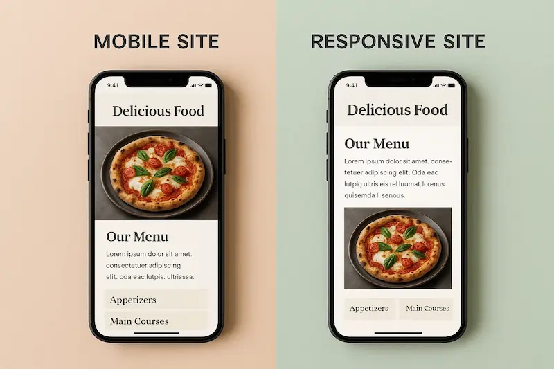
Consider your user’s intent. A separate site might be an option if your mobile users have a different goal than your desktop users. For example, a miniature mobile version of a restaurant website might only need a menu, phone number, and map.
A complete desktop experience might include a blog or a photo gallery. This is an edge case. For most businesses, the user functionality should be the same.
Long-Term SEO and Digital Marketing Strategy
From an SEO perspective, responsive design is the best choice. It aligns with Google’s mobile-first indexing. It avoids duplicate content. The responsive design also centralizes your ranking signals.
This makes it easier to track your performance and easily optimize your website. Your long-term digital marketing strategy will be more successful with a responsive site.
Implementation Tips for Building a Mobile Site or Responsive Site with WordPress
If you are a WordPress user, creating a responsive site is straightforward. The platform is well-suited for this approach.
Choosing a Responsive WordPress Theme and Child Theme Customisation
The best way to start is by choosing a responsive WordPress theme. Many modern themes are built with responsive design principles in mind. They use fluid grids and CSS media queries. Use a child theme for customizations. This ensures your changes aren’t overwritten when the main theme updates.
Avoiding Separate Mobile Plugins and Sub-domains
Avoid plugins that create a separate mobile site or subdomain. These tools can lead to duplicate content and maintenance issues. They often make a different mobile-friendly design. This can break your consistent user experience.
Using Progressive Enhancement and Mobile-First CSS in WordPress
You can apply progressive enhancement principles in WordPress. First, use CSS to define styles for smaller screens. Then, use media queries to add styles for different screen sizes. Implement lazy-loading for images. This will improve site speed for mobile users.
Conclusion: Key Differences Summarized and Final Recommendations
The difference between a mobile site and a responsive site is fundamental. A mobile site is a separate mobile site with its URL. It is a dated approach with SEO and maintenance pitfalls. A responsive site is a single website. It adapts to different devices using responsive web design. This is the modern, recommended standard.
For most businesses, the choice is clear. Responsive design is the superior strategy. It provides a better user experience. It’s more cost-effective to maintain. Most importantly, it is the best approach for SEO. Google’s mobile-first approach makes this the logical choice.
When making your decision, consider this checklist:
- SEO: Do you want to avoid duplicate content and rank well on Google? Choose responsive.
- Maintenance: Do you want to manage one codebase instead of two? Choose responsive.
- User Experience: Do you want a consistent experience across all screen sizes? Choose responsive.
- Budget: Do you want a cost-effective and scalable solution? Choose responsive.
Responsive web design provides the best foundation for long-term success. It ensures your website is fast, accessible, and user-friendly for everyone, on every device.
