Mobile devices are now the primary way people browse the web and use apps. As screens get smaller, the way users navigate content becomes more important. Web designers must create navigation patterns that are simple, intuitive, and efficient. Two of the most common mobile navigation patterns are hamburger menus and tab bars.
Both aim to balance usability and design, but they come with different advantages and drawbacks. Choosing the right one depends on your app, your users, and the type of content you want to highlight.
In this article, we’ll compare hamburger menus and tab bars in detail. We’ll also look at alternatives and help you decide which option best fits your mobile design.
An Overview of Mobile Navigation
Mobile navigation is all about making digital experiences simple on small screens. Unlike desktops, mobile devices have limited real estate. That means you need to prioritize key features and ensure users can reach them with minimal effort.
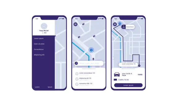
Good mobile navigation reduces cognitive load, meaning users don’t have to think too much about where to go next. Instead, they should be able to focus on the content or tasks at hand.
The main goals of mobile navigation are:
- Provide easy access to core features.
- Maximize screen space for content.
- Reduce the number of taps to reach important pages.
- Support intuitive thumb movements.
When designing for mobile, you also need to consider how users physically interact with their devices.
- Thumb reach matters: Most people use their thumbs for navigation. That’s why bottom navigation is often easier to access than top navigation.
- Screen size is limited: Mobile devices don’t have much room. Hiding or simplifying navigation helps prioritize what matters.
- Orientation changes: Some users hold phones vertically, others horizontally. A good navigation design should adapt to both.
Because of these challenges, designers experiment with different patterns to find the right balance between accessibility and space.
With that in mind, let’s dive into the two main approaches: hamburger menus and tab bars.
Read about: How to Easily Fix Responsive Menu Issues in WordPress
Hamburger Menu Design
The hamburger menu is one of the most recognizable navigation icons in mobile design. Represented by three horizontal lines, it helps designers simplify interfaces while still giving users access to multiple features. By hiding navigation options until needed, it balances functionality with a clean layout.
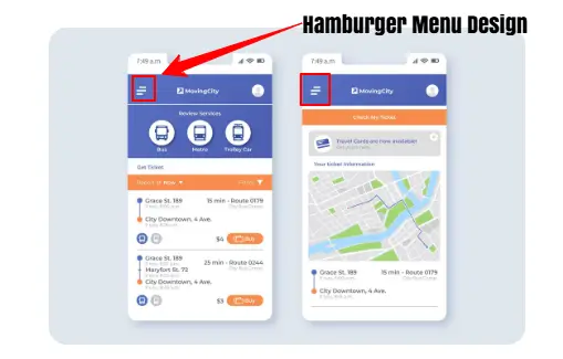
How It Works: Typically, the hamburger menu is placed at the top left corner of the screen for easy access. When tapped, it opens a side drawer or overlay, revealing navigation links and options. This menu can also include multiple categories and subcategories, making it useful for apps with layered content.
Why Designers Use It: Designers often choose the hamburger menu for apps that have a large number of features or settings. By keeping less important items hidden, it ensures the main screen remains uncluttered and content-focused. Moreover, it allows secondary or rarely used options to stay accessible without overwhelming the interface.
Best Use Case: Hamburger menus are ideal for apps with secondary features like things users don’t need all the time. They’re less effective for apps where fast, frequent navigation is key.
Complete Guide: How to Fix Mobile View on Your WordPress Website
Hamburger Menu: Pros and Cons
Depending on how it is used, the hamburger menu offers advantages and drawbacks. Understanding its pros and cons can guide designers in making effective navigation choices.
| Pros | Cons |
| Maximizes screen space and keeps the interface clean by hiding navigation. | It has hidden navigation, so users may overlook important features that are tucked away. |
| Simplifies design and reduces clutter and distractions for a focused interface. | It can reduce engagement as items behind menus may receive fewer clicks. |
| Supports multiple options and works well for apps with many categories or settings. | It increases cognitive load as users must remember where features are located. |
Tab Bar Design Navigation
Tab bars offer a contrasting approach to mobile navigation. Unlike hamburger menus, they display core navigation options upfront, making it easy for users to access key features without extra taps. By keeping essential items visible, tab bars enhance usability while maintaining a clean interface.
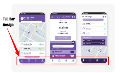
How It Works: Tab bars are placed at the bottom of the screen, within easy reach of users’ thumbs. They usually feature 4 to 5 main options, often accompanied by a “more” button to access additional features. Each tab uses icons or text labels to clearly indicate its purpose, helping users navigate without confusion.
Why Designers Use It: Designers favor tab bars for their simplicity and intuitiveness. Since the options are always visible, users can move quickly between important sections.
This design is thumb-friendly, reducing effort and improving overall usability. Tab bars work particularly well for apps where core features are used frequently, such as social media, shopping, or productivity apps.
Best Use Case: Tab bars are ideal for apps with a few core features that users access regularly. Think of social apps like Instagram or shopping apps where quick navigation matters.
Tab Bars: Pros and Cons
Here are the pros and cons of using Tab Bars for mobile device navigation:
| Pros | Cons |
| It offers a visible navigation, so users see core options immediately without extra taps. | It takes up the screen space, which reduces the space available for content. |
| It reduces cognitive load, so users don’t need to search for key features. | It is not scalable. It works best with a limited number of tabs (4 or 5). |
| Tab bars are quick to access, making it ideal for frequent navigation between main sections. | Can feel crowded and too many icons may overwhelm or confuse users. |
Hamburger Menus vs Tab Bars: Key Comparisons
Choosing the right mobile navigation pattern is critical for user experience. Both hamburger menus and tab bars have their strengths and weaknesses. Understanding how they differ in key areas can help web designers make informed decisions.
Hamburger Menus or Tab Bars: Visibility
One of the main differences between hamburger menus and tab bars is visibility.
- Hamburger Menu: Navigation items are hidden behind the icon, requiring users to tap to access them. While this keeps the interface clean, it can make it harder for users to discover certain features.
- Tab Bar: Options are always visible at the bottom of the screen. Users can immediately see core navigation items, encouraging faster interaction and reducing confusion.
Verdict: In terms of visibility, tab bars have a clear advantage because they reduce the steps needed to reach essential features.
Check out: Difference Between a Mobile Site and Responsive Site
Tab Bars and Hamburger Menus: Screen Space
Screen space is another important factor in mobile design.
- Hamburger Menu: By hiding options, hamburger menus free up valuable space on the main screen. This allows content to take center stage, making the app feel less cluttered.
- Tab Bar: Tab bars occupy a permanent strip at the bottom of the screen. While this makes navigation more accessible, it reduces the area available for content.
Verdict: If maximizing screen space is a priority, especially for content-heavy apps, hamburger menus may be preferable.
Read more: Responsive WordPress Web Design
Hamburger Menus vs Tab Bars: User Engagement
Navigation design also influences how users interact with an app.
- Hamburger Menu: Hidden navigation can result in lower engagement. Users are less likely to explore features that are not immediately visible, which may limit app usage.
- Tab Bar: Visible navigation options promote higher engagement. Users can quickly switch between sections, increasing the likelihood that they will explore all core features.
Verdict: For apps that rely on frequent user interaction, tab bars are often more effective at keeping users engaged.
Key Differences: Reactive Website vs Responsive Website
Tab Bars or Hamburger Menus: Scalability
Scalability refers to how well a navigation pattern handles many options.
- Hamburger Menu: These menus can accommodate numerous categories and subcategories. They are ideal for apps with complex content structures or multiple secondary features.
- Tab Bar: Tab bars work best with a small number of tabs, usually 4 or 5. Adding more can overcrowd the interface and make navigation confusing.
Verdict: A hamburger menu may be the more scalable choice if your app has a wide range of features.
Know more: Can Lovable Make Mobile Apps
Hamburger Menu and Tab Bars: Ease of Use
Finally, consider the ease of use for your audience.
- Hamburger Menu: Accessing features requires extra taps, which can slow down navigation and increase cognitive load. Users must remember where options are located, which may reduce efficiency.
- Tab Bar: Users can jump directly to core features with a single tap. This reduces effort and makes the app more intuitive, especially for new users.
Verdict: Tab bars offer better ease of use for apps that rely on frequent and quick access to core functionality.
Find out: How to Choose the Right App Design Agency
Alternative Navigation Patterns
While hamburger menus and tab bars are the most common mobile navigation options, they are not the only choices.
Designers often explore floating menus and gesture-based navigation to enhance usability, accessibility, and overall user experience. These patterns can be used alone or combined with traditional navigation for a hybrid approach.
Floating Menus
Floating menus remain visible as users scroll, providing constant access to key features. They allow users to reach important functions quickly without returning to the main menu.
Additionally, floating menus appear only when needed, freeing up screen space and keeping the interface clean. This approach is particularly useful for apps where certain actions need to be readily accessible at all times.
Learn: UX Design Tips & Tools You Must Know About
Gesture-Based Navigation
Gesture-based navigation relies on swipes, taps, or edge gestures instead of static buttons. It creates a natural, thumb-friendly experience, allowing users to navigate intuitively through the app. This method can reduce reliance on traditional navigation bars, making the interface feel more modern and fluid.
By incorporating floating menus or gesture-based navigation, designers can offer faster, more intuitive access to core features. These alternatives work well for apps seeking to streamline navigation while maintaining flexibility and user engagement.
Also read: How to Fix WordPress Navigation Menu Appearing Under Admin Bar
Mobile Design Considerations
Designing a mobile navigation requires careful thought. Before choosing a pattern, it’s important to consider the app’s purpose, the audience, and how users interact with it. Navigation should adapt to users, not force them to adapt to the interface.
- Purpose of the App: Define the app’s goals. Does it require quick access to a few core features, or does it need to accommodate many options and categories? The purpose will influence whether a tab bar, hamburger menu, or alternative navigation works best.
- Target Audience: Next, consider your audience. Are users tech-savvy or casual mobile users? Tech-savvy users may adapt more easily to gesture-based navigation, while casual users often prefer clear, visible options.
- Screen Size and Orientation: Screen size and device orientation also matter. Most users operate on phones, but some may use tablets or rotate screens. Your navigation should adapt smoothly to different devices and orientations.
- User Behavior: Observe how users interact with the app. Do they scroll frequently, jump between features quickly, or focus on one task at a time? Understanding behavior helps design navigation that supports natural interactions.
Mobile Navigation and Interface Design
Effective mobile design requires navigation and interface to work together seamlessly. A clean interface with confusing navigation frustrates users, while visible navigation on a cluttered screen can overwhelm them. By following best practices, designers can create an intuitive and enjoyable user experience.
- Keep Navigation Simple: Navigation should be easy to understand and consistent throughout the app. Users should know where to find key features without extra effort or guesswork. Predictable patterns reduce cognitive load and improve overall usability.
- Use Icons with Labels for Clarity: Icons help save space, but pairing them with labels ensures clarity. Clear visual cues prevent confusion and allow users to quickly identify the purpose of each navigation element.
- Test with Real Users: Before launch, conduct user testing to validate your design. Observing real users interacting with the app helps uncover pain points and improve navigation efficiency.
- Ensure Consistent Design Across Platforms: Maintain a uniform look and feel across devices and operating systems. Consistency helps users transfer their knowledge between platforms, enhancing familiarity and comfort.
- Anticipate User Needs: The best mobile interfaces predict users’ wants and minimize unnecessary steps. By prioritizing essential actions and reducing friction, designers create apps that are both intuitive and engaging.
Conclusion
Mobile navigation is one of the most important design decisions you’ll make. Both hamburger menus and tab bars have strengths and weaknesses.
Hamburger menus free up space and handle many features, but hide navigation. Tab bars are simple and accessible but limited in scale. Alternatives like floating menus and gesture-based navigation can add flexibility.
Ultimately, the right choice depends on your app’s purpose, audience, and content. So, always prioritize user experience, simplicity, and ease of use. With the right navigation, your app can deliver a smooth, intuitive, and enjoyable experience every time.
FAQs About Mobile Navigation
What is a hamburger menu in mobile apps?
A hamburger menu icon is a symbol consisting of three horizontal lines that opens a navigation drawer containing menu options for mobile apps.
Why do apps use bottom tab bars?
A bottom tab bar provides quick access to top-level features, making navigation easier and allowing users to reach key elements without extra taps.
How does a hidden menu affect usability?
While a hidden menu saves valuable screen space, it may reduce discoverability. Apps that prioritize intuitive navigation often balance hidden menus with visible icons.
What are the benefits of using consistent icons?
Consistent icons create a user-friendly interface and help users learn how apps behave, making the overall experience more intuitive.
How can apps provide more screen space for content?
Designs like a hamburger icon or bottom tab allow designers to display content without clutter, giving more screen space for the main interface.
Why is responsive design important for modern web and mobile apps?
A responsive design ensures that apps behave properly across devices, maintaining an intuitive user experience and screen real estate efficiency.
How can designers make mobile apps more intuitive?
By prioritizing intuitive design, intuitive apps use menu items, consistent icons, and navigation patterns like bottom tab bars to guide many users seamlessly.
