Great products aren’t built in a vacuum; they’re crafted with users in mind. From the very first wireframe to the final user interface, the experience you create can make or break user adoption. That’s where design tools like Figma and platforms like Lovable come into play.
Figma has long been the go-to platform for collaborative interface design. Its intuitive layout, real-time collaboration, and vast plugin ecosystem make it a favorite among designers. On the other hand, Lovable is emerging as a platform focused on turning those designs into delightful, user-centered experiences.
In this article, we’ll explore how to move from Figma to Lovable seamlessly, keeping design integrity intact while enhancing usability. Whether you’re a product manager, UX designer, or startup founder, this guide will help you build a user-friendly interface that your audience will love.
What is User-Centered Design?
User-centered design (UCD) is an approach that places users at the core of the design process. It focuses on their needs, behaviors, and pain points throughout the product lifecycle.
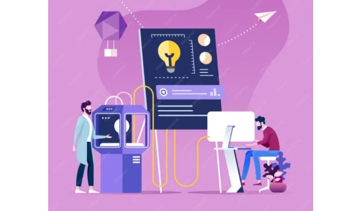
Rather than designing based on assumptions, UCD encourages continuous validation through research, testing, and iteration.
Why Empathy Matters?
Empathy is not just a buzzword; it’s the foundation of user-friendly interfaces. By imagining yourself in your users’ shoes, you create designs that feel intuitive and solve real problems.
Consider this: if your user can’t figure out how to navigate your product in a few seconds, they’re likely to leave. That’s the cost of a design that lacks empathy.
Ultimate Guide: Core Principles of UX Design Methodology
Key Principles of User-Centered Design (UCD)
A deep understanding of user needs lies at the heart of every user-friendly interface. User-Centered Design (UCD) is not just a methodology; it’s a mindset. It emphasizes designing with empathy and ensuring that every interaction feels intuitive.
To apply UCD effectively, there are a few core principles that should guide your design decisions.
Understand Users’ Goals and Contexts
Start by gaining clarity on what your users are trying to achieve and the environment they’re in when interacting with your product. Whether they’re on mobile during a commute or sitting at a desktop in an office, context shapes behavior. Research, personas, and journey mapping are vital here.
Involve Users Early and Often
Don’t wait until the product is almost finished to bring in users. Instead, engage them from the beginning. Conduct interviews, usability tests, or surveys during key design stages. This ensures you’re building the right thing from the start.
Know more: Best UX Design Firms
Design for Usability, Not Just Aesthetics
While clean visuals are important, usability is non-negotiable. A beautiful interface that’s hard to navigate will frustrate users. Focus on clarity, intuitive navigation, and accessibility throughout.
Iterate Based on Feedback
Design is never one-and-done. Use feedback loops, whether from analytics, user testing, or stakeholder reviews, to refine your product continuously. Every iteration brings you closer to a more lovable and user-friendly experience.
By staying grounded in these principles, you ensure that your design serves users, not just your assumptions.
Need Help with Your Figma to Lovable Transition?
Whether you’re facing technical hurdles or just want expert guidance to streamline your design handoff, we’re here to help.
The Role of Figma in Interface Design
Today, designing functional and user-friendly interfaces requires agile tools , and Figma fits that role perfectly. It’s more than just a design tool; it’s a collaborative hub for product teams.
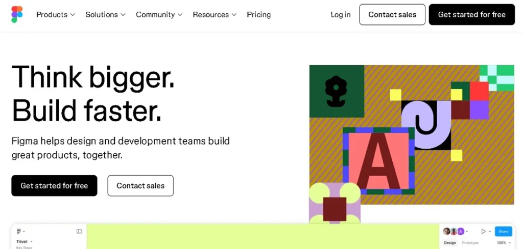
With its cloud-based infrastructure and intuitive features, Figma streamlines the entire design process from ideation to prototyping.
Real-Time Collaboration Across Teams
One of Figma’s most impactful features is real-time collaboration. Designers, developers, and stakeholders can work simultaneously on the same file; no version control headaches or endless email threads. Everyone stays on the same page, quite literally. This live collaboration is especially valuable for remote teams, startups, and cross-functional groups that prioritize speed and transparency.
Prototyping That Brings Ideas to Life
Figma goes beyond static visuals. Its built-in prototyping capabilities allow you to simulate real user flows and interactions, such as screen transitions, hover states, and microinteractions.
This means your team can test and refine user journeys before writing a single line of code. Better yet, stakeholders can leave contextual feedback directly on the prototype, making the revision process smoother and more focused.
By integrating Figma into your design workflow, you don’t just build faster, you build smarter. And when it’s time to move from Figma to platforms like Lovable, the transition becomes far more efficient and user-focused.
Read more: Top Product Design Tools Every Designer
Transitioning from Figma to Lovable for a Seamless Workflow
As design teams move from ideation to implementation, maintaining design consistency across platforms becomes crucial. Transitioning from Figma to Lovable is a key part of that process.
However, to ensure that the final product reflects your original vision, it’s important to follow a structured approach. Here are the steps to preserve design integrity and adapt your work smoothly to Lovable’s unique framework.
Preserving Design Integrity
Your design is more than just pixels; it’s a carefully constructed experience. When moving designs from Figma to Lovable, consistency is key.
Component naming, spacing, typography, and layout hierarchy must remain intact to avoid breaking the user experience.
Even minor inconsistencies can cause confusion, impact usability, and dilute your brand identity. So, take the time to audit your files before the Figma export stage. Aligning your team on shared naming conventions and styles can save hours later.
Learn: Latest Trends in Website UI/UX Design Services
Exporting Designs from Figma
To ensure a smooth export, follow these essential steps:
- Use organized frames: Label each screen clearly to provide clarity for developers and collaborators.
- Group reusable components: To maintain consistency, define and group elements like buttons, input fields, and navigation bars.
- Export in appropriate formats: Use SVG for icons and vector graphics, and PNG for images or assets that require pixel-based rendering.
- Provide a style guide: Include typography specs, color codes, padding values, and usage rules. This ensures visual consistency and easier adaptation within Lovable.
Related: How to Export Figma Designs Into Lovable
Adapting for Lovable’s Framework
While importing your Figma designs into Lovable is generally straightforward, some adjustments may be required.
- Lovable operates on its own interaction and component logic, which means layout behavior may differ slightly.
- Take this opportunity to enhance your design using Lovable’s built-in UX features such as accessibility options, mobile-first responsiveness, or motion-friendly components.
While preserving your original layout, consider refining interactions to better align with how Lovable structures user experiences.
By following these steps, you make the Figma to Lovable transition seamless and strategically beneficial, ensuring a polished, user-centered final product.
Explore: UI UX Design Services for SaaS Products
Best Practices for User-Friendly Interface Design
Creating a user-friendly interface goes beyond visual appeal; it’s about crafting experiences that feel intuitive, accessible, and seamless.

Whether you’re designing a mobile app or a web dashboard, following best practices ensures your product meets user expectations and reduces friction.
Let’s explore three key principles that elevate interface design.
Keep it Consistent
Consistency helps users develop familiarity with your product. When colors, typography, icons, and button styles remain uniform across screens, users can predict interactions with ease. This lowers the learning curve and builds trust.
Figma’s design systems and component libraries are ideal tools for maintaining visual and behavioral consistency. Reusing components also speeds up your workflow and reduces design errors.
Prioritize Accessibility
Accessibility isn’t just ethical; it’s essential. Users of all abilities should be able to navigate your interface effortlessly. Start with color contrast for visibility, use readable font sizes, and add descriptive alt text for images and icons.
Fortunately, both Figma and Lovable offer features and plugins that help audit and align your design with accessibility standards (e.g., WCAG). Make these checks part of your design process, not an afterthought.
Also read: WordPress Accessibility Compliance with WCAG
Embrace Whitespace
Whitespace or negative space is a powerful yet often overlooked design element. It improves content readability, guides the user’s eye, and enhances the overall aesthetic.
Instead of cramming too much into each screen, give elements room to breathe. As a rule of thumb: when in doubt, space it out.
Discover: Best eCommerce UI Design Themes and Example Sites
Leveraging Figma Plugins for Enhanced Design
Figma’s plugin ecosystem amplifies productivity and sharpens user-centered outcomes. By extending core capabilities, plugins help you work faster, reduce errors, and build more user-friendly interfaces. Below are key ways to leverage them.
Useful Plugins to Try
First, start with a handful of high-impact plugins:
- Unsplash lets you insert high-quality, royalty-free images quickly.
- Content Reel fills mockups with realistic text and data, making prototypes feel grounded.
- Stark audits color contrast and accessibility, helping you meet inclusive design standards.
- Autoflow visualizes user journeys, clarifying navigation and flow logic.
- Figmotion adds motion to prototypes, so you can simulate interaction before development.
These tools support both Figma to Lovable transition by ensuring the design system you export is mature and tested.
Improving Workflow with Plugins
Plugins eliminate repetitive manual tasks. Instead of adjusting spacing, generating placeholders, or repeatedly checking contrast by hand, these extensions automate the heavy lifting. As a result, your team spends less time on busywork and more time refining the user experience. This also speeds up iteration cycles and keeps designs aligned with user-centered goals.
Enhancing the User Experience
Finally, some plugins directly influence how users perceive your product. For example, Stark and similar accessibility tools help you catch issues early, improving usability for all. Meanwhile, Figmotion lets you test micro-interactions, so you understand emotional and behavioral responses before code is written.
Read about: Top Trends in Corporate Web Design
Testing and Iterating Designs
No matter how polished your design looks, it’s still just a hypothesis until users validate it. Testing helps uncover usability issues that internal teams may miss. It ensures that your design aligns with real-world behavior, not just assumptions.
By testing early and often, you can prevent costly redesigns and ship a truly user-friendly interface.
How to Collect User Feedback
To make informed design decisions, you need the right feedback. Try combining these methods for well-rounded insights:
- User Interviews: Direct conversations reveal emotional responses and pain points.
- A/B Testing: Test two versions of a layout or flow to see which performs better.
- Heatmaps: Understand where users click, scroll, or hesitate the most.
- Click Tracking: Follow the exact paths users take to uncover friction.
- In-Prototype Surveys: Add simple feedback prompts within Figma prototypes.
Tools like UsabilityHub or even Figma’s commenting features make it easy to gather this data without disrupting the design process.
Iteration is Where Magic Happens
Once you’ve gathered insights, the real work begins. Don’t hesitate to make changes, whether it’s adjusting button placements, streamlining navigation, or simplifying forms. These tweaks, however small, can significantly improve usability.
Remember, design is an ongoing process. Striving for constant improvement rather than perfection is what ultimately results in a lovable and intuitive interface.
Future Trends in UI Design
User interface design is constantly evolving to meet rising user expectations and adapt to new technologies. As digital experiences become more integrated into everyday life, designers must stay ahead of the curve.
From AI personalization to touchless interaction, the future of UI is both exciting and challenging. Let’s explore the key trends shaping the next wave of user-friendly design.
Emerging Design Elements to Watch
New interaction models are changing the way users engage with interfaces. For instance, voice commands are reducing reliance on screens, while gesture-based navigation is becoming more intuitive with devices like smart TVs and wearables.
Additionally, expect to see increased use of:
- Micro-interactions that offer subtle feedback and delight.
- Dark mode as a default option, enhancing readability and reducing eye strain.
- Motion design that brings visual hierarchy and storytelling into the user journey.
These elements don’t just add flair, they enhance usability and engagement.
Also read: Sustainable Web Design Trends
Predicting What’s Next
Looking forward, the UI landscape is leaning heavily into:
- Hyper-personalization: Interfaces that adapt based on user behavior and preferences.
- Touchless interfaces: Voice, eye tracking, and gesture control gaining momentum.
- AR (Augmented Reality): Merging digital elements into real-world contexts for interactive design.
Designers who embrace these innovations will be better positioned to create experiences that feel natural, relevant, and engaging.
Read: WordPress Development Trends
The Role of Figma and Lovable
Both Figma and Lovable are evolving to support these new paradigms. Figma’s auto-layout, AI-powered suggestions, and expanding plugin ecosystem make it a future-ready design platform. Meanwhile, Lovable’s UX-first deployment model ensures those designs are brought to life efficiently and responsively.
Together, they empower teams to experiment, iterate, and deliver cutting-edge interfaces that not only meet today’s standards, but anticipate tomorrow’s needs.
Learn more: Top White Label Web Design Trends
To Sum Up
Designing a user-friendly interface is both an art and a science. With tools like Figma for design and Lovable for deployment, you’re equipped to deliver experiences that are not just functional but memorable.
We’ve walked through the essentials, from user-centered design principles to exporting from Figma, enhancing with plugins, and transitioning to Lovable without losing design integrity.
The key takeaway? Always put users first. Understand their needs, test your assumptions, and iterate based on real-world feedback.
If you can do that, every screen you design will be not only usable but also lovable.
Figma to Lovable FAQs
What is Lovable, and how is it different from Figma?
Figma is a design tool, while Lovable is a platform focused on deploying user-friendly, production-ready interfaces.
Can I import my Figma files directly into Lovable?
Yes, you can import designs, but some components may need adjustment to match Lovable’s framework.
Do I need to redesign everything in Lovable?
No. If your Figma files are structured well, you can maintain most of your design integrity with minimal rework.
What file formats work best when exporting from Figma to Lovable?
SVG and PNG formats are commonly used for exporting assets like icons and images.
How can I ensure my design stays consistent after transition?
Use organized layers, reusable components, and provide a detailed style guide during handoff.
Does Lovable support accessibility features?
Yes, Lovable includes built-in tools to support WCAG-compliant, accessible design implementation.
Can I get support for transitioning my project?
Absolutely! Our team can help guide your Figma to Lovable workflow for a smoother launch.
